I know. And have you seen how funny the word possibilities actually looks? Read it four times. Does it still look correct?
As for this posts content. I have found a video on youtube where two points on radar charts are explained that come in handy for neat high level presentations. When working with radar charts you might want to get rid of the central zero and the central gridlines. The video shows the solution for the first challenge and a workaround for the second. Check it out here.
But what if we want to have a clean scale-safe solution? Correct, read on! This works in Excel 2007.
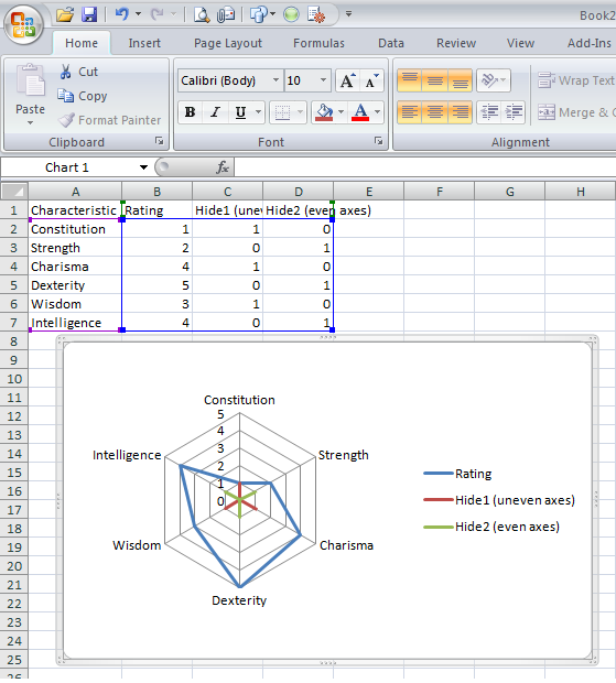
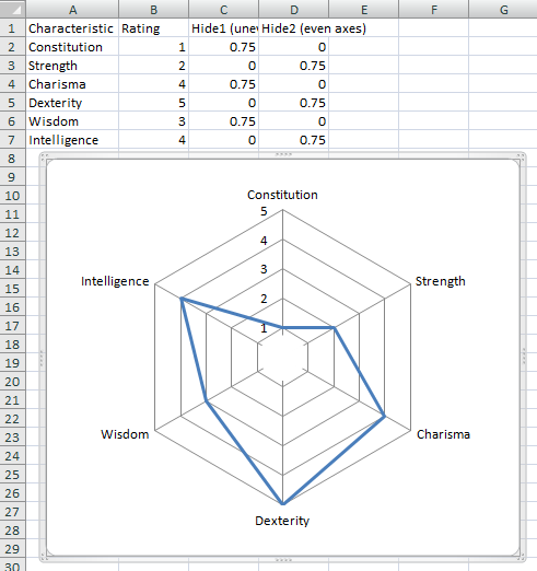
Why would you not want to follow (overlay) the gridlines with an extra series? So I did just that. The least expensive solution for a six category chart came with two additional series as seen below. I left them colored to show what thay will hide.
I have shortened the hiding line somewhat for aesthetics and colored the white. That’s it.
There are some caveats though. E.g. the axis units need to be fixed.
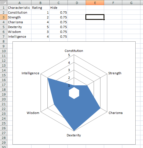
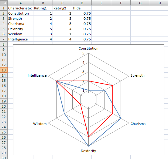
Is there an easier way? Actually there is. With only one additional series you can hide as many axes as you want. Make that chart a ‘filled radar chart’.
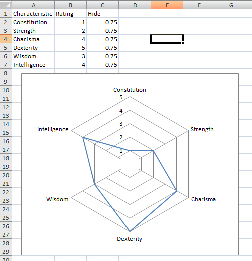
Now, for the hiding series select white marker fill with no lines. For the visible series you have to do exactly the opposite: no marker, no marker line, no marker fill but line color instead. And there you go:
The good thing is that it also works with multiple series:
Ok, why not set the hiding series to ‘filled radar’ and the other to line? You can of course do that. To make it work though is a whole new level of customization, e.g. chage the hiding series to secondary axis, scale the secondary axis according to the first one, get rid of the visible parts of the secondary axis etc.
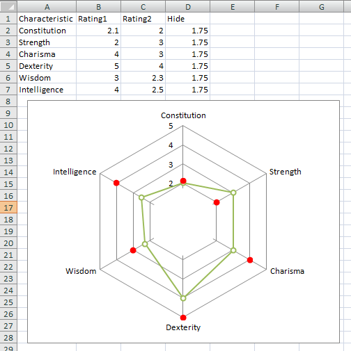
Granted, once you are through with that the possibilities are somewhat-less-limited:
Oh, and I did set the minimum to “2” with the custom number format “[>1]0;;;”.
Am I still yohoing? I guess so: Yoho!

 TripleDrop
 TriPop
 PaperWolf: Training
