Coming in with a lot of (continuous numerical) data, I struggled to find a neat chart type to display it. I went for a contour plot but it needs the data sorted in rows and columns while my data consisted of 5000 rows and two columns. Manual ordering would have been possible but to work intensive (5000 rows!). And since COUNTIF does not come with the ability two compare two criteria (or I just did not find it) I figured out a pretty good workaround. By the way, this works in Excel2007 but should work in 2003 and 2010 too.
Let’s assume I have got the data for a process (like a flow and a temperature) and I would like to see where the main operating point of a piece of equipment is. This requires three dimensions and is best shown in a countour plot (fig. a).
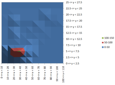
Fig. a) The contour plot
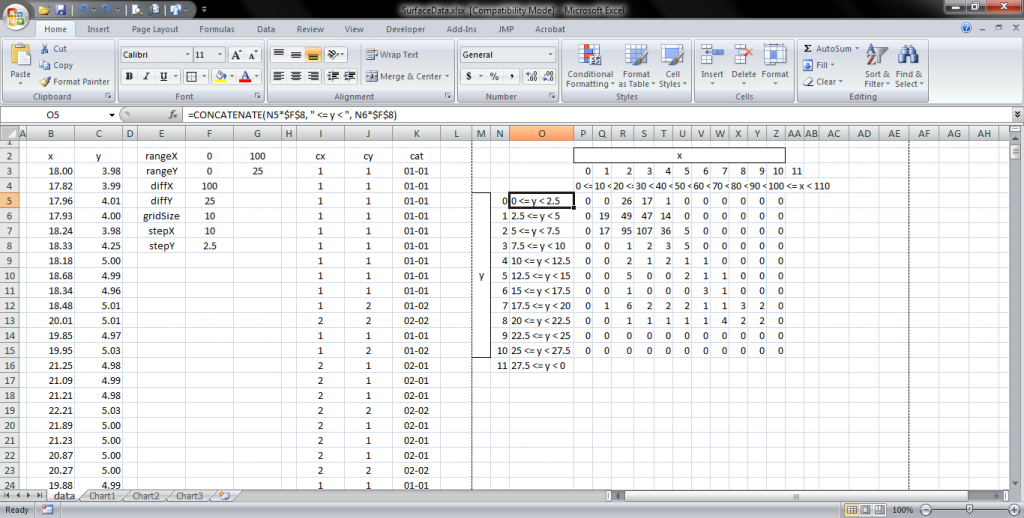
The data structure we need can be seen here. In the case of TL;DR we need columns for x values (or x value categories in the case of continuous numerical data) and rows for the y values (or categories). What I needed was the number of value pairs (x and y) fitting into each of the category pairs. But before that:
Setting up the data grid
An example spreadsheed follows at the end of this article, feel free to peek into it to follow my explanations.
Since we want to sort values (value pairs) we need some categories they fit in. To set up a category grid I first retrieved the following variables:
The value ranges can be retrieved by the functions MIN and MAX. To have even values as categories, it is proven useful to nest those intoFLOOR respectively CEILING. Caveat: FLOOR and CEILING in excel do round AWAY from zero and need a significance related to the actual value.
So, if you’d like to FLOOR all values (away from zero) and you’ve got positive and negative numbers you could write =FLOOR(yourCell,IF(yourCell>=0, 1,-1)).
If you’d rather like to have a floor rounding like in ActionsScript you would need to write =IF(yourCell<0, CEILING(yourCell, -1), FLOOR(yourCell,1)) or the other way around for the 'real' ceiling rounding.
I recommend the second if you need categories in the negative to get the best bounds. The significance also has potential to influence the display of the data, so choose that depending on what you got or looks best.
The span just is the difference between min and max range value. I will not post the formula for this one. If you can't figure that out, you probably should not use excel or look it up in the attached example spreadsheet.
The step size is the quotient of span by grid size.
Categorization
Now that we have that, we set up three more columns:
COUNTIF function as a single criterionThe x and y category column hold the quotients of the actual value by step size. Using FLOOR returns the value by means of greater than or equal to the lower bound and less than the upper bound.
The core piece of this workaround is the category column. With =CONCATENATE(x category cell, "-", y category cell) a hybrid label is created, in that case it returns something like "1-3" or "4-2" which is exactly one of the combinations we later look for with COUNTIF. If your gird size is equal to or exceeds 10 you may need to add leading zeros by =CONCATENATE(IF(I3<10, "0", ""), I3, "-", IF(J3<10, "0", ""), J3). The returned values the look like "01-10" or "04-04". But that is more of an aesthetical thing.
The grid data and the chart
Now that's pretty simple again. Set up a table with x categories as the column headers and y categories as row headers. Enter =COUNTIF(category column, CONCATENATE(IF(x catgory<10,"0",""),x category,"-",IF(y category<10,"0",""),y category)). What it does is computing the category name (the combination) on the fly and counting how many labels in the category column it equals.
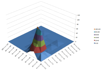
Then just mark the cells (insert some row and column headings to use in the chart if you like first) and insert a surface chart or contour plot.
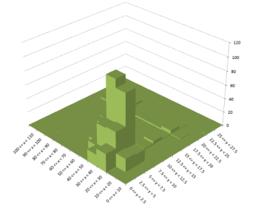
Something I tested also, was a 3D column chart as a 3D histogram.
It might sound difficult at first but feel free to play with the example and make some nice charts. If there are questions just post a comment.
Source: SurfaceData.xlsx

 TripleDrop
 TriPop
 PaperWolf: Training

6 Responses to Excel: Preparing/Categorizing data for contour plots, surface plots and 3D histograms